
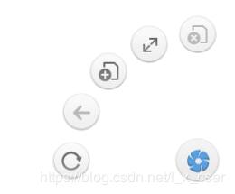
本文实例为大家分享了js+css实现扇形导航效果的具体代码,供大家参考,具体内容如下\
<!DOCTYPE html>
<html>
 <head>
 <meta charset="utf-8">
 <title>扇形导航</title>
 <style type="text/css">
  *{
  margin: 0;
  padding: 0;
  }
  html,body{
  height: 100%;
  overflow: hidden;
  }
  #wrap{
  height: 50px;
  width: 50px;
  /* background-color: pink; */
  position: fixed;
  right: 15px;
  bottom: 15px;
  /* overflow: hidden; */
  }
  #wrap>.home{
  height: 49px;
  width: 49px;
  /* margin: auto; */
  background: url(img/home.png) ;
  background-position: center;
  border-radius: 50%;
  transition: 1s;
  position: absolute;
  z-index: 1;
  }
  #wrap>.nav{
  height: 100%;
  position: relative;
  }
  #wrap>.nav>img{
  position: absolute ;
  right: 0px;
  bottom: 0px;
  margin: 4px;
  border-radius: 50% ;
  }
  .home:hover{
  transform: rotate(360);
  }
 </style>
 </head>
 <body>
 <div id="wrap">
  <div class="home"></div>
  <div class="nav">
  <img src="img/clos.png" >
  <img src="img/full.png" >
  <img src="img/open.png" >
  <img src="img/prev.png" >
  <img src="img/refresh.png" >
  </div>
 </div>
 </body>
 <script type="text/javascript">
 window.onload =function(){
  var homeEle = document.querySelector("#wrap>.home");
  var flag= true;
  var imgs =document.querySelectorAll("#wrap>.nav>img");


  function fn(){
  this.style.transition=0.3+"s";
  this.style.transform ="rotate(-360deg) scale(1)";
  this.style.opacity =1;
  this.removeEventListener("transitionend",fn);
  }

  for (var i=0;i<imgs.length;i++) {
  imgs[i].onclick =function(){
   this.style.transform ="rotate(-360deg) scale(2)";
   this.style.transition ="0.3s";
   this.style.opacity =0.1;

   this.addEventListener("transitionend",fn);
  }
  }

  homeEle.onclick =function(){
  console.log(imgs.length);
  if(flag){
   this.style.transform="rotate(-720deg) ";
   imgs.forEach((index,No)=>{
   imgs[No].style.right = getLocation(140,No*22.5/180*Math.PI).left+"px";
   imgs[No].style.bottom = getLocation(140,No*22.5/180*Math.PI).top+"px";
   imgs[No].style.transform ="rotate(-360deg) scale(1)";
   imgs[No].style.transition ="1s "+No*0.1+"s";
   });
  }else{
   this.style.transform="rotate(0)";
   imgs.forEach((index,No)=>{
   imgs[No].style.right = 0+"px";
   imgs[No].style.bottom = 0+"px";
   imgs[No].style.transform ="rotate(0deg) scale(1)";
   imgs[No].style.transition="1s "+(0.4-No*0.1)+"s";
   });
  }
  flag =!flag;
  }

  var getLocation =function(r,deg){
  var x =Math.round(r*Math.sin(deg));
  var y =Math.round(r*Math.cos(deg));
  return{left:x,top:y};
  }

 }

 </script>
</html>
以上就是本文的全部内容,希望对大家的学习有所帮助,也希望大家多多支持自学编程网。
- 本文固定链接: https://zxbcw.cn/post/193568/
- 转载请注明:必须在正文中标注并保留原文链接
- QQ群: PHP高手阵营官方总群(344148542)
- QQ群: Yii2.0开发(304864863)