
读取excel数据需要用到xlrd模块,在命令行运行下面命令进行安装
pip install xlrd
表格内容大致如下,有若干sheet,每个sheet记录了同一所学校的所有学生成绩,分为语文、数学、英语、综合、总分
| 考号 | 姓名 | 班级 | 学校 | 语文 | 数学 | 英语 | 综合 | 总分 |
| ... | ... | ... | ... | 136 | 136 | 100 | 57 | 429 |
| ... | ... | ... | ... | 128 | 106 | 70 | 54 | 358 |
| ... | ... | ... | ... | 110.5 | 62 | 92 | 44 | 308.5 |
画多张子图需要用到subplot函数
subplot(nrows, ncols, index, **kwargs)
想要在一张画布上按如下格式画多张子图
语文 --- 数学
英语 --- 综合
----- 总分 ----
需要用的subplot参数分别为
subplot(321) --- subplot(322)
subplot(323) --- subplot(324)
subplot(313)
#!/usr/bin/env python
# -*- coding:utf-8 -*-
from xlrd import open_workbook as owb
import matplotlib.pyplot as plt
#import matplotlib.colors as colors
#from matplotlib.ticker import MultipleLocator, FormatStrFormatter, FuncFormatter
import numpy as np
districts=[] # 存储各校名称--对应于excel表格的sheet名
data_index = 0
new_colors = ['#1f77b4', '#ff7f0e', '#2ca02c', '#d62728',
'#9467bd', '#8c564b', '#e377c2', '#7f7f7f',
'#bcbd22', '#17becf']
wb = owb('raw_data.xlsx') # 数据文件
active_districts = ['二小','一小','四小'] ## 填写需要画哪些学校的,名字需要与表格内一致
avg_yuwen = []
avg_shuxue = []
avg_yingyu = []
avg_zonghe = []
avg_total = []
'按页数依次读取表格数据作为Y轴参数'
for s in wb.sheets():
#以下两行用于控制是否全部绘图,还是只绘选择的区
#if s.name not in active_districts:
# continue
print('Sheet: ', s.name)
districts.append(s.name)
avg_score = 0
yuwen = 0
shuxue = 0
yingyu = 0
zonghe = 0
zongfen = 0
total_student = 0
for row in range(1,s.nrows):
total_student += 1
#读取各科成绩并计算平均分
yuwen = yuwen + (s.cell(row, 4).value - yuwen)/total_student # 语文
shuxue = shuxue + (s.cell(row, 5).value - shuxue) / total_student # 数学
yingyu = yingyu + (s.cell(row, 6).value - yingyu) / total_student # 英语
zonghe = zonghe + (s.cell(row, 7).value - zonghe) / total_student # 综合
zongfen = zongfen + (s.cell(row, 8).value - zongfen) / total_student # 总分
avg_yuwen.append(yuwen)
avg_shuxue.append(shuxue)
avg_yingyu.append(yingyu)
avg_zonghe.append(zonghe)
avg_total.append(zongfen)
data_index += 1
print('开始画图...')
plt.rcParams['font.sans-serif']=['SimHei'] # 中文支持
plt.rcParams['axes.unicode_minus']=False # 中文支持
figsize = 11,14
fig = plt.figure(figsize=figsize)
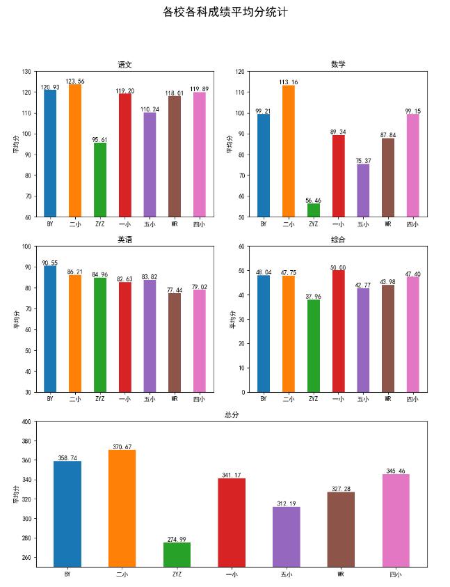
fig.suptitle('各校各科成绩平均分统计',fontsize=18)
my_x=np.arange(len(districts))
width=0.5
ax1 = plt.subplot(321)
#total_width=width*(len(districts))
b = ax1.bar(my_x , avg_yuwen, width, tick_label=districts, align='center', color=new_colors)
for i in range(0,len(avg_yuwen)):
ax1.text(my_x[i], avg_yuwen[i], '%.2f' % (avg_yuwen[i]), ha='center', va='bottom',fontsize=10)
ax1.set_title(u'语文')
ax1.set_ylabel(u"平均分")
ax1.set_ylim(60, 130)
ax2 = plt.subplot(322)
ax2.bar(my_x, avg_shuxue, width, tick_label=districts, align='center', color=new_colors)
for i in range(0, len(avg_shuxue)):
ax2.text(my_x[i], avg_shuxue[i], '%.2f' %(avg_shuxue[i]), ha='center', va='bottom', fontsize=10)
ax2.set_title(u'数学')
ax2.set_ylabel(u'平均分')
ax2.set_ylim(50,120)
ax3 = plt.subplot(323)
b = ax3.bar(my_x , avg_yingyu, width, tick_label=districts, align='center', color=new_colors)
for i in range(0,len(avg_yingyu)):
ax3.text(my_x[i], avg_yingyu[i], '%.2f' % (avg_yingyu[i]), ha='center', va='bottom',fontsize=10)
ax3.set_title(u'英语')
ax3.set_ylabel(u"平均分")
ax3.set_ylim(30, 100)
ax4 = plt.subplot(324)
b = ax4.bar(my_x , avg_zonghe, width, tick_label=districts, align='center', color=new_colors)
for i in range(0,len(avg_zonghe)):
ax4.text(my_x[i], avg_zonghe[i], '%.2f' % (avg_zonghe[i]), ha='center', va='bottom',fontsize=10)
ax4.set_title(u'综合')
ax4.set_ylabel(u"平均分")
ax4.set_ylim(0, 60)
ax5 = plt.subplot(313)
total_width=width*(len(districts))
b = ax5.bar(my_x , avg_total, width, tick_label=districts, align='center', color=new_colors)
for i in range(0,len(avg_total)):
ax5.text(my_x[i], avg_total[i], '%.2f' % (avg_total[i]), ha='center', va='bottom',fontsize=10)
ax5.set_title(u'总分')
ax5.set_ylabel(u"平均分")
ax5.set_ylim(250, 400)
plt.savefig('avg.png')
plt.show()
这样虽然能画出来,但是需要手动写每个subplot的代码,代码重复量太大,能不能用for循环的方式呢?
继续尝试,
先整理出for循环需要的不同参数
avg_scores = [] # 存储各科成绩,2维list
subjects = ['语文','数学','英语','综合','总分'] #每个子图的title
plot_pos = [321,322,323,324,313] # 每个子图的位置
y_lims = [(60,130), (50,120), (30,100), (0,60), (200,400)] # 每个子图的ylim参数
数据读取的修改比较简单,但是到画图时,如果还用 ax = plt.subplots(plot_pos[pos])方法的话,会报错
Traceback (most recent call last):
 File "...xxx.py", line 66, in <module>
 b = ax.bar(my_x , y_data, width, tick_label=districts, align='center', color=new_colors) # 画柱状图
AttributeError: 'tuple' object has no attribute 'bar'
搜索一番,没找到合适的答案,想到可以换fig.add_subplot(plot_pos[pos]) 试一试,结果成功了,整体代码如下
#!/usr/bin/env python
# -*- coding:utf-8 -*-
from xlrd import open_workbook as owb
import matplotlib.pyplot as plt
#import matplotlib.colors as colors
#from matplotlib.ticker import MultipleLocator, FormatStrFormatter, FuncFormatter
import numpy as np

districts=[] # 存储各校名称--对应于excel表格的sheet名
total_stu=[] # 存储各区学生总数
data_index = 0
new_colors = ['#1f77b4', '#ff7f0e', '#2ca02c', '#d62728',
    '#9467bd', '#8c564b', '#e377c2', '#7f7f7f',
    '#bcbd22', '#17becf']
wb = owb('raw_data.xlsx') # 数据文件
active_districts = ['BY','二小','一小','WR','四小'] ## 填写需要画哪些学校的,名字需要与表格内一致
avg_scores = [] # 存储各科成绩,2维list
subjects = ['语文','数学','英语','综合','总分'] #每个子图的title
plot_pos = [321,322,323,324,313] # 每个子图的位置
y_lims = [(60,130), (50,120), (30,100), (0,60), (200,400)] # 每个子图的ylim参数

'按页数依次读取表格数据作为Y轴参数'
for s in wb.sheets():
 #以下两行用于控制是否全部绘图,还是只绘选择的区
 #if s.name not in active_districts:
  # continue
 print('Sheet: ', s.name)
 districts.append(s.name)
 avg_scores.append([])
 yuwen = 0
 shuxue = 0
 yingyu = 0
 zonghe = 0
 zongfen = 0
 total_student = 0
 for row in range(1,s.nrows):
  total_student += 1
  #tmp = s.cell(row,4).value
  yuwen = yuwen + (s.cell(row, 4).value - yuwen)/total_student # 语文
  shuxue = shuxue + (s.cell(row, 5).value - shuxue) / total_student # 数学
  yingyu = yingyu + (s.cell(row, 6).value - yingyu) / total_student # 英语
  zonghe = zonghe + (s.cell(row, 7).value - zonghe) / total_student # 综合
  zongfen = zongfen + (s.cell(row, 8).value - zongfen) / total_student # 总分
 avg_scores[data_index].append(yuwen)
 avg_scores[data_index].append(shuxue)
 avg_scores[data_index].append(yingyu)
 avg_scores[data_index].append(zonghe)
 avg_scores[data_index].append(zongfen)
 data_index += 1

print('开始画图...')
plt.rcParams['font.sans-serif']=['SimHei']
plt.rcParams['axes.unicode_minus']=False
figsize = 11,14
fig = plt.figure(figsize=figsize)
fig.suptitle('各校各科成绩平均分统计',fontsize=18)
my_x=np.arange(len(districts))
width=0.5

print(avg_scores)
for pos in np.arange(len(plot_pos)):
 #ax = plt.subplots(plot_pos[pos])
 ax = fig.add_subplot(plot_pos[pos]) # 如果用ax = plt.subplots会报错'tuple' object has no attribute 'bar'
 y_data = [x[pos] for x in avg_scores] # 按列取数据
 print(y_data)
 b = ax.bar(my_x , y_data, width, tick_label=districts, align='center', color=new_colors) # 画柱状图
 for i in np.arange(len(y_data)):
  ax.text(my_x[i], y_data[i], '%.2f' % (y_data[i]), ha='center', va='bottom',fontsize=10) # 添加文字
 ax.set_title(subjects[pos])
 ax.set_ylabel(u"平均分")
 ax.set_ylim(y_lims[pos])

plt.savefig('jh_avg_auto.png')
plt.show()
和之前的结果一样,能找到唯一一处细微差别嘛

以上这篇Python matplotlib读取excel数据并用for循环画多个子图subplot操作就是小编分享给大家的全部内容了,希望能给大家一个参考,也希望大家多多支持自学编程网。

- 本文固定链接: https://zxbcw.cn/post/190700/
- 转载请注明:必须在正文中标注并保留原文链接
- QQ群: PHP高手阵营官方总群(344148542)
- QQ群: Yii2.0开发(304864863)