
pyecharts介绍
pyecharts 是一个用于生成 Echarts 图表的类库。Echarts 是百度开源的一个数据可视化 JS 库。用 Echarts 生成的图可视化效果非常棒
为避免绘制缺漏,建议全部安装
为了避免下载缓慢,作者全部使用镜像源下载过了
pip install -i https://pypi.tuna.tsinghua.edu.cn/simple/ echarts-countries-pypkg
pip install -i https://pypi.tuna.tsinghua.edu.cn/simple/ echarts-china-provinces-pypkg
pip install -i https://pypi.tuna.tsinghua.edu.cn/simple/ echarts-china-cities-pypkg
pip install -i https://pypi.tuna.tsinghua.edu.cn/simple/ echarts-china-counties-pypkg
pip install -i https://pypi.tuna.tsinghua.edu.cn/simple/ echarts-china-misc-pypkg
pip install -i https://pypi.tuna.tsinghua.edu.cn/simple/ echarts-united-kingdom-pypkg

基础案例
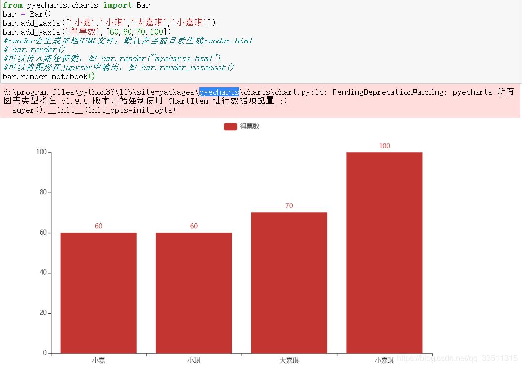
from pyecharts.charts import Bar
bar = Bar()
bar.add_xaxis(['小嘉','小琪','大嘉琪','小嘉琪'])
bar.add_yaxis('得票数',[60,60,70,100])
#render会生成本地HTML文件,默认在当前目录生成render.html
# bar.render()
#可以传入路径参数,如 bar.render("mycharts.html")
#可以将图形在jupyter中输出,如 bar.render_notebook()
bar.render_notebook()
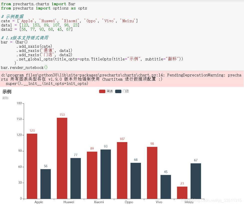
from pyecharts.charts import Bar
from pyecharts import options as opts

# 示例数据
cate = ['Apple', 'Huawei', 'Xiaomi', 'Oppo', 'Vivo', 'Meizu']
data1 = [123, 153, 89, 107, 98, 23]
data2 = [56, 77, 93, 68, 45, 67]

# 1.x版本支持链式调用
bar = (Bar()
    .add_xaxis(cate)
    .add_yaxis('渠道', data1)
    .add_yaxis('门店', data2)
    .set_global_opts(title_opts=opts.TitleOpts(title="示例", subtitle="副标"))
   )
bar.render_notebook()
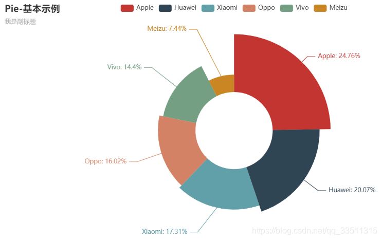
from pyecharts.charts import Pie
from pyecharts import options as opts

# 示例数据
cate = ['Apple', 'Huawei', 'Xiaomi', 'Oppo', 'Vivo', 'Meizu']
data = [153, 124, 107, 99, 89, 46]

pie = (Pie()
    .add('', [list(z) for z in zip(cate, data)],
      radius=["30%", "75%"],
      rosetype="radius")
    .set_global_opts(title_opts=opts.TitleOpts(title="Pie-基本示例", subtitle="我是副标题"))
    .set_series_opts(label_opts=opts.LabelOpts(formatter="{b}: {d}%"))
   )

pie.render_notebook()
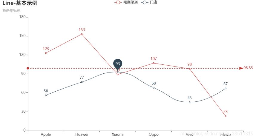
from pyecharts.charts import Line
from pyecharts import options as opts

# 示例数据
cate = ['Apple', 'Huawei', 'Xiaomi', 'Oppo', 'Vivo', 'Meizu']
data1 = [123, 153, 89, 107, 98, 23]
data2 = [56, 77, 93, 68, 45, 67]

"""
折线图示例:
1. is_smooth 折线 OR 平滑
2. markline_opts 标记线 OR 标记点
"""
line = (Line()
    .add_xaxis(cate)
    .add_yaxis('电商渠道', data1,
         markline_opts=opts.MarkLineOpts(data=[opts.MarkLineItem(type_="average")]))
    .add_yaxis('门店', data2,
         is_smooth=True,
         markpoint_opts=opts.MarkPointOpts(data=[opts.MarkPointItem(name="自定义标记点",
                                       coord=[cate[2], data2[2]], value=data2[2])]))
    .set_global_opts(title_opts=opts.TitleOpts(title="Line-基本示例", subtitle="我是副标题"))
   )

line.render_notebook()
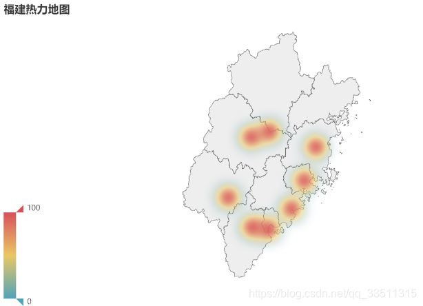
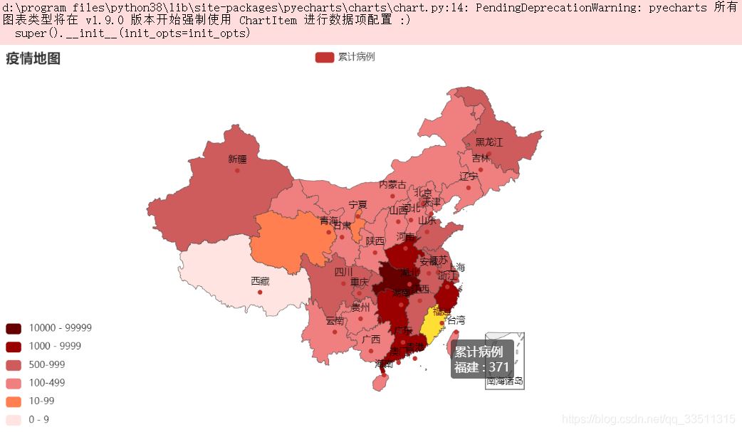
from pyecharts import options as opts
from pyecharts.charts import Geo
from pyecharts.globals import ChartType
import random

province = ['福州市', '莆田市', '泉州市', '厦门市', '漳州市', '龙岩市', '三明市', '南平']
data = [(i, random.randint(200, 550)) for i in province]

geo = (Geo()
    .add_schema(maptype="福建")
    .add("门店数", data,
      type_=ChartType.HEATMAP)
    .set_series_opts(label_opts=opts.LabelOpts(is_show=False))
    .set_global_opts(
      visualmap_opts=opts.VisualMapOpts(),
      legend_opts=opts.LegendOpts(is_show=False),
      title_opts=opts.TitleOpts(title="福建热力地图"))
   )

geo.render_notebook()

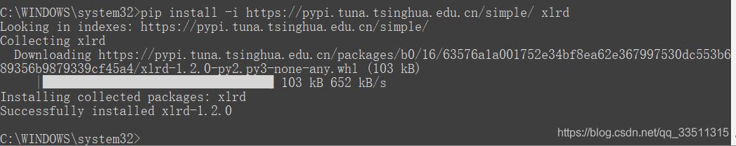
啊哈这个还访问不了哈
ImportError: Missing optional dependency ‘xlrd'. Install xlrd >= 1.0.0 for Excel support Use pip or conda to install xlrd.

20200822pyecharts+pandas 初步学习
作者今天学习做数据分析,有错误请指出
下面贴出源代码
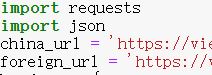
# 获取数据
import requests
import json
china_url = 'https://view.inews.qq.com/g2/getOnsInfo?name=disease_h5'
#foreign_url = 'https://view.inews.qq.com/g2/getOnsInfo?name=disease_foreign'
headers = {
'User-Agent': 'Mozilla/5.0 (Windows NT 10.0; Win64; x64) AppleWebKit/537.36 (KHTML, like Gecko) Chrome/84.0.4147.125 Safari/537.36 Edg/84.0.522.59',
'referer': 'https://news.qq.com/zt2020/page/feiyan.htm'
}
#获取json数据
response = requests.get(url=china_url,headers=headers).json()
print(response)
#先将json数据转 python的字典
data = json.loads(response['data'])
#保存数据 这里使用encoding='utf-8' 是因为作者想在jupyter上面看
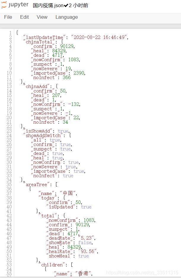
with open('./国内疫情.json','w',encoding='utf-8') as f:
#再将python的字典转json数据
# json默认中文以ASCII码显示 在这里我们以中文显示 所以False
#indent=2:开头空格2
f.write(json.dumps(data,ensure_ascii=False,indent=2))
转换为json格式输出的文件
# 将json数据转存到Excel中
import pandas as pd
#读取文件
with open('./国内疫情.json',encoding='utf-8') as f:
data = f.read()
#将数据转为python数据格式
data = json.loads(data)
type(data)#字典类型
lastUpdateTime = data['lastUpdateTime']
#获取中国所有数据
chinaAreaDict = data['areaTree'][0]
#获取省级数据
provinceList = chinaAreaDict['children']
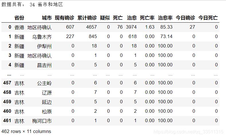
# 获取的数据有几个省市和地区
print('数据共有:',len(provinceList),'省市和地区')
#将中国数据按城市封装,例如【{湖北,武汉},{湖北,襄阳}】,为了方便放在dataframe中
china_citylist = []
for x in range(len(provinceList)):
# 每一个省份的数据
province =provinceList[x]['name']
#有多少个市
province_list = provinceList[x]['children']
for y in range(len(province_list)):
# 每一个市的数据
city = province_list[y]['name']
# 累积所有的数据
total = province_list[y]['total']
# 今日的数据
today = province_list[y]['today']
china_dict = {'省份':province,
'城市':city,
'total':total,
'today':today
}
china_citylist.append(china_dict)
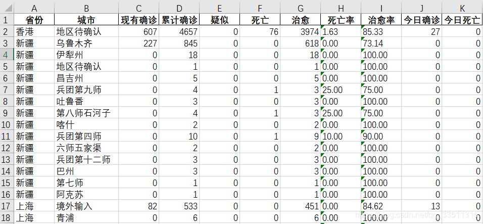
chinaTotaldata = pd.DataFrame(china_citylist)
nowconfirmlist=[]
confirmlist=[]
suspectlist=[]
deadlist=[]
heallist=[]
deadRatelist=[]
healRatelist=[]
# 将整体数据chinaTotaldata的数据添加dataframe
for value in chinaTotaldata['total'] .values.tolist():#转成列表
confirmlist.append(value['confirm'])
suspectlist.append(value['suspect'])
deadlist.append(value['dead'])
heallist.append(value['heal'])
deadRatelist.append(value['deadRate'])
healRatelist.append(value['healRate'])
nowconfirmlist.append(value['nowConfirm'])
chinaTotaldata['现有确诊']=nowconfirmlist
chinaTotaldata['累计确诊']=confirmlist
chinaTotaldata['疑似']=suspectlist
chinaTotaldata['死亡']=deadlist
chinaTotaldata['治愈']=heallist
chinaTotaldata['死亡率']=deadRatelist
chinaTotaldata['治愈率']=healRatelist
#拆分today列
today_confirmlist=[]
today_confirmCutlist=[]
for value in chinaTotaldata['today'].values.tolist():
today_confirmlist.append(value['confirm'])
today_confirmCutlist.append(value['confirmCuts'])
chinaTotaldata['今日确诊']=today_confirmlist
chinaTotaldata['今日死亡']=today_confirmCutlist
#删除total列 在原有的数据基础
chinaTotaldata.drop(['total','today'],axis=1,inplace=True)
# 将其保存到excel中
from openpyxl import load_workbook
book = load_workbook('国内疫情.xlsx')
# 避免了数据覆盖
writer = pd.ExcelWriter('国内疫情.xlsx',engine='openpyxl')
writer.book = book
writer.sheets = dict((ws.title,ws) for ws in book.worksheets)
chinaTotaldata.to_excel(writer,index=False)
writer.save()
writer.close()
chinaTotaldata
作者这边还有国外的,不过没打算分享出来,大家就看看,总的来说我们国内情况还是非常良好的

到此这篇关于python绘图pyecharts+pandas的使用详解的文章就介绍到这了,更多相关pyecharts pandas使用内容请搜索自学编程网以前的文章或继续浏览下面的相关文章希望大家以后多多支持自学编程网!

- 本文固定链接: https://zxbcw.cn/post/202024/
- 转载请注明:必须在正文中标注并保留原文链接
- QQ群: PHP高手阵营官方总群(344148542)
- QQ群: Yii2.0开发(304864863)