
在大多数 web 产品中,全局的 Message 组件占有较大的使用场景,它常出现在给与用户反馈、信息提示和与系统的对话场景中。如果使用传统的组件写法,则需要引入组件并在 components 中注册,然后再去模板中以标签的形式调用,传入自定义 props 属性并通过 emit 触发事件,这类的组件往往有以下缺点:
- 需要频繁引入并注册
- 需要在模板中以标签的形式使用组件
- 需要额外的参数控制组件的属性和状态
- 不能友好的自定义组件的挂载位置,会被其他组件影响
因此对于 Message 这类的组件,我们希望可以在 JavaScript 中调用,可以传入自定义参数控制组件状态,并且无需在调用的时候手动挂载组件到 body 尾部。如果你使用过主流第三方库,例如 ElementUI plus 或 Ant Design for Vue, 那么你肯定熟悉他们的消息组件 API,接下来就一起用 Vue3 实现一个全局的 Message 组件吧。
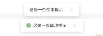
组件最终实现效果
组件设计
定义最终的组件 API
实现一个简易的 Message 消息组件,包含类型 API 有文本(text)、成功(success)、失败(error),即支持直接传入一段文本,也支持通过组件具体的 option 配置,来自定义消息内容、关闭延迟、以及是否展示关闭按钮等功能。
// Message 类型(type):文本、成功、失败
["text", "success", "error"]

// Message 选项(option)
[String]: 消息内容
[Object]: 消息配置

// option 配置
text [String] "" 消息内容
duration [Number] 0 自动关闭延迟毫秒数,0为不自动关闭
close [Boolean] false 是否展示关闭按钮

// 调用方式
Message[type](option);
调用示例
Message.text("这是一条消息提示");
Message.error({
    text: "网络错误,请稍后再试",
    duration: 3000,
    close: true
});
定义组件结构
建立 Message 文件夹存储组件的整体结构,其中 src 中包含组件的模板、样式和实例文件,同级下,建立 index.js 将整个组件暴露出去,以便在项目和业务组件中引入。
|--- Message
 |--- src
 | |--- Message.vue // 组件模板
 | |--- Message.less // 提供组件样式支持
 | |--- Message.js // 读取配置并渲染组件实例
 | |--- Instance.js // 组件实例
 |---index.js // 暴露组件
模板和样式
模板 Template
模板相对来说比较简单,外层由动画组件包裹,通过 v-show 去控制消息显示和关闭,内容部分包括图标、消息文本、以及可配置的手动关闭按钮。
<template>
  <!-- 消息列表 -->
  <transition name="slide-fade">
    <div class="message-container" v-show="visibled">
      <!-- 内容 -->
      <div class="message-content">

        <!-- 消息类型图标,通过消息类型确定,text类型不配置图标 -->
        <div class="message-icon" v-if="config.icon">
          <i :class="config.icon"></i>
        </div>

  <!-- 消息文本 -->
        <span v-text="config.content"></span>

        <!-- 手动关闭消息 -->
        <div class="option" v-if="!config.close">
          <i class="ri-close-fill" @click="onClose"></i>
        </div>

      </div>
    </div>
  </transition>
</template>
消息图标
需要注意的是,图标是由调用 API 中的类型确定,在创建实例的时候确定图标类型,这里引用的是开源图标库 Remix Icon,具体的引用方法这里不多赘述,地址:remixicon.cn/
样式
在 Message.less 中定义样式和动画。
@radius: 4px;
@normalHeight: 34px;

.message {
  position: fixed;
  top: 0;
  left: 0;
  width: 100%;
  text-align: center;
  box-sizing: border-box;
  z-index: 9999;
  transform: translateZ(9999px);
  padding-top: 28px;
  transition: top .4s ease;

  .message-container {
    margin-bottom: 14px;

    .message-icon {
      display: inline-block;

      i {
        font-size: 18px;
        font-weight: 400;
        margin-top: -3px;
        margin-right: 6px;
        display: inline-block;
        box-sizing: border-box;
        vertical-align: middle;
      }

      .ri-checkbox-circle-fill {
        color: #58c05b;
      }

      .ri-close-circle-fill {
        color: #fd4f4d;
      }

    .message-content {
      display: inline-block;
      padding: 4px 18px;
      height: @normalHeight;
      text-align: left;
      line-height: @normalHeight;
      font-size: 14px;
      font-weight: 400;
      border-radius: @radius;
      color: #595959;
      box-shadow: 0 4px 12px rgba(0, 0, 0, .15);
      background: #ffffff;

      .option {
        display: inline-block;
        pointer-events: all;
        margin-left: 18px;

        i {
          font-size: 18px;
          font-weight: 400;
          margin-top: -3px;
          display: inline-block;
          box-sizing: border-box;
          vertical-align: middle;
          cursor: pointer;
          color: #d9d9d9;
          transition: color 0.2s ease;

          &:hover {
            color: #ff7c75;
            transition: color 0.2s ease;
          }
        }
      }
    }
  }

  .slide-fade-enter-active {
    transition: all .2s ease-out;
  }

  .slide-fade-leave-active {
    transition: all .2s ease;
  }

  .slide-fade-enter-from,
  .slide-fade-leave-to {
    transform: translateY(-20px);
    opacity: 0;
  }
}
组件脚本
组件中通过获取传入的config配置和remove实现渲染和取消挂载,通过onOpen和onClose方法控制消息打开和手动关闭,具体代码如下:
<script>
import { reactive, toRefs } from "vue";
export default {
  props: {
    config: { type: Object, default: () => {} }, // 消息配置项
    remove: { type: Function, default: () => {} }, // 取消挂载回调
  },
  setup(props) {
    const state = reactive({
      visibled: false,
    })

    // 打开消息
    const onOpen = (config) => {
      setTimeout(() => {
        state.visibled = true;
      }, 10)

      // 指定时间后移除消息
      if (config.duration !== 0) {
        setTimeout(() => {
          onClose();
        }, config.duration);
      }
    }

    onOpen(props.config)

    // 消息关闭
    const onClose = () => {
      state.visibled = false;
      setTimeout(() => {
        props.remove()
      }, 200)
    };

    return {
      ...toRefs(state),
      onOpen,
      onClose,
    };
  },
};
</script>
创建组件实例
接下来将在 Instance.js 中编写组件调用时创建、挂载、销毁组件等 API,头部引入 Vue 的创建实例方法和上面写好的组件模板:
import { createApp } from 'vue'
import Message from './Message.vue'
声明实例操作方法,接受一个消息配置参数cfg
/**
 * Message 实例操作
 * @param {Object} cfg 实例配置
 */
const createInstance = cfg => {
 const config = cfg || {}
 // 1、创建包裹容器,并设置外层的 Class 属性、消息计数

 // 2、创建实例并挂载到 body

 // 3、实现取消挂载方法,和取消挂载后重新计数
}
export default createInstance
1、创建包裹容器,并设置外层的 Class 属性
创建一个 DIV 作为外层容器包裹组件,并设置对应 class 属性
let messageNode = document.createElement('div')
let attr = document.createAttribute("class")
attr.value = "message"
messageNode.setAttributeNode(attr)
消息计数,我们定义一个消息弹框的高度为 54 px,在多个消息排队打开的时候,通过设置 top 值使各组件错开。
const height = 54 // 单个消息框高度

const messageList = document.getElementsByClassName('message')
messageNode.style.top = `${messageList.length * height}px`
2、创建实例并挂载到 body
const app = createApp(Message, {
  config,
  remove() {
    handleRemove()// 移除元素,消息关闭后从 Dom 上取消挂载并移除
  }
})

// 挂载实例并追加到 body 结尾
app.vm = app.mount(messageNode)
document.body.appendChild(messageNode)

app.close = () => {
  handleRemove()
}

return app
3、其中定义取消挂载和重新设置 top 值的方法
const handleRemove = ()=>{
  app.unmount(messageNode)
  document.body.removeChild(messageNode)
  resetMsgTop()
 }

const resetMsgTop = () => {
  for (let i = 0; i < messageList.length; i++) {
    messageList[i].style.top = `${i * height}px`
  }
}
实现渲染实例 API
通过 Message.js 去读取配置并渲染。
import createInstance from './Instance.js'

/**
 * 读取配置并渲染 Message
 * @param {Object} typeCfg 类型配置
 * @param {Object/String} cfg 自定义配置
 */
function renderMsg(typeCfg = {}, cfg = '') {
  // 允许直接传入消息内容,因此要判断传入的 cfg 类型
  const isContent = typeof cfg === 'string'

  // 整合自定义配置
  cfg = isContent ? {
    content: cfg
  } : cfg

  const config = Object.assign({}, typeCfg, cfg) // 合并配置

  const {
    type = 'text', // 消息类型
    content = '', // 消息内容
    duration = 3000, // 自动关闭延迟时间
    close = false // 是否显示关闭按钮
  } = config

  // 创建实例
  return createInstance({
    type,
    content,
    duration,
    close
  })
}
暴露text、success、error等 API。
export default {
  // 纯文本消息
  text(cfg = "") {
    const textCfg = {
      type: "text",
      icon: ''
    }

    return renderMsg(textCfg, cfg);
  },
  // 成功提示
  success(cfg = "") {
    const successCfg = {
      type: "success",
      icon: 'ri-checkbox-circle-fill'
    }

    return renderMsg(successCfg, cfg);
  },
  // 错误提示
  error(cfg = "") {
    const errorCfg = {
      type: "error",
      icon: 'ri-close-circle-fill'
    }

    return renderMsg(errorCfg, cfg);
  },
}
最后,在最外层的index.js中开放这个组件以供调用。
import Message from './src/Message.js';

export default Message;
到此这篇关于 Vue3实现Message消息组件示例的文章就介绍到这了,更多相关Vue3 Message消息组件内容请搜索自学编程网以前的文章或继续浏览下面的相关文章希望大家以后多多支持自学编程网!
- 本文固定链接: https://zxbcw.cn/post/215555/
- 转载请注明:必须在正文中标注并保留原文链接
- QQ群: PHP高手阵营官方总群(344148542)
- QQ群: Yii2.0开发(304864863)