
一、当我们用Python matplot时作图时,一些数据需要以百分比显示,以更方便地对比模型的性能提升百分比。
二、借助matplotlib.ticker.FuncFormatter(),将坐标轴格式化。
例子:
# encoding=utf-8
import matplotlib.pyplot as plt
from matplotlib.ticker import FuncFormatter
plt.rcParams['font.family'] = ['Times New Roman']
plt.rcParams.update({'font.size': 8})
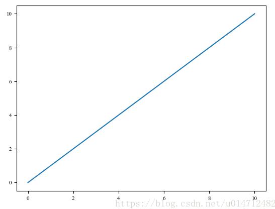
x = range(11)
y = range(11)
plt.plot(x, y)
plt.show()
图形显示如下:
现在我们将横纵坐标变成百分比形式即,0%,20%,40%....代码如下:
# encoding=utf-8
import matplotlib.pyplot as plt
from matplotlib.ticker import FuncFormatter
plt.rcParams['font.family'] = ['Times New Roman']
plt.rcParams.update({'font.size': 8})
x = range(11)
y = range(11)
plt.plot(x, y)

def to_percent(temp, position):
  return '%1.0f'%(10*temp) + '%'
plt.gca().yaxis.set_major_formatter(FuncFormatter(to_percent))
plt.gca().xaxis.set_major_formatter(FuncFormatter(to_percent))

plt.show()
即增加了10~13的代码,执行结果如下:
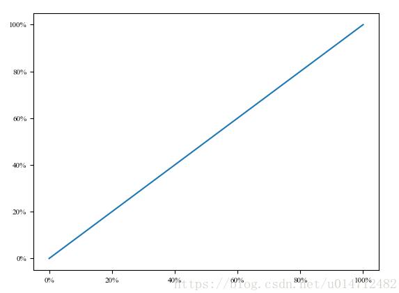
可见已经实现我们的需求。
重要代码
return '%1.0f'%(10*temp) + '%' #这句话指定了显示的格式。
更多格式化显示,可以查看matplotlib.ticker。
补充知识:matplotlib画图系列之设置坐标轴(精度、范围,标签,中文字符显示)
在使用matplotlib模块时画坐标图时,往往需要对坐标轴设置很多参数,这些参数包括横纵坐标轴范围、坐标轴刻度大小、坐标轴名称等
在matplotlib中包含了很多函数,用来对这些参数进行设置。
plt.xlim、plt.ylim 设置横纵坐标轴范围
plt.xlabel、plt.ylabel 设置坐标轴名称
plt.xticks、plt.yticks设置坐标轴刻度
以上plt表示matplotlib.pyplot
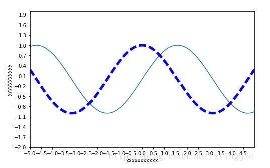
例子
#导入包
import matplotlib.pyplot as plt
import numpy as np
#支持中文显示
from pylab import *
mpl.rcParams['font.sans-serif'] = ['SimHei']

#创建数据
x = np.linspace(-5, 5, 100)
y1 = np.sin(x)
y2 = np.cos(x)

#创建figure窗口
plt.figure(num=3, figsize=(8, 5))
#画曲线1
plt.plot(x, y1)
#画曲线2
plt.plot(x, y2, color='blue', linewidth=5.0, linestyle='--')
#设置坐标轴范围
plt.xlim((-5, 5))
plt.ylim((-2, 2))
#设置坐标轴名称
plt.xlabel('xxxxxxxxxxx')
plt.ylabel('yyyyyyyyyyy')
#设置坐标轴刻度
my_x_ticks = np.arange(-5, 5, 0.5)
my_y_ticks = np.arange(-2, 2, 0.3)
plt.xticks(my_x_ticks)
plt.yticks(my_y_ticks)

#显示出所有设置
plt.show()
结果
以上这篇使用Python matplotlib作图时,设置横纵坐标轴数值以百分比(%)显示就是小编分享给大家的全部内容了,希望能给大家一个参考,也希望大家多多支持自学编程网。

- 本文固定链接: https://zxbcw.cn/post/186650/
- 转载请注明:必须在正文中标注并保留原文链接
- QQ群: PHP高手阵营官方总群(344148542)
- QQ群: Yii2.0开发(304864863)