
2020
10-08
10-08
Element InputNumber 计数器的实现示例
 前言这篇我们继续研究InputNumber。基本实现基本的准备工作过后,开始基本实现。上测试代码:<el-input-numberv-model="num"@change="handleChange":min="1":max="10"label="描述文字"></el-input-number>上组件代码:<template><div:class="['el-input-number',]"><spanclass="el-input-number__decrease"role="button":class="{'is-disabled':minDisabled}"@click="decrease"><iclass="el-icon-minus"...
继续阅读 >
前言这篇我们继续研究InputNumber。基本实现基本的准备工作过后,开始基本实现。上测试代码:<el-input-numberv-model="num"@change="handleChange":min="1":max="10"label="描述文字"></el-input-number>上组件代码:<template><div:class="['el-input-number',]"><spanclass="el-input-number__decrease"role="button":class="{'is-disabled':minDisabled}"@click="decrease"><iclass="el-icon-minus"...
继续阅读 >
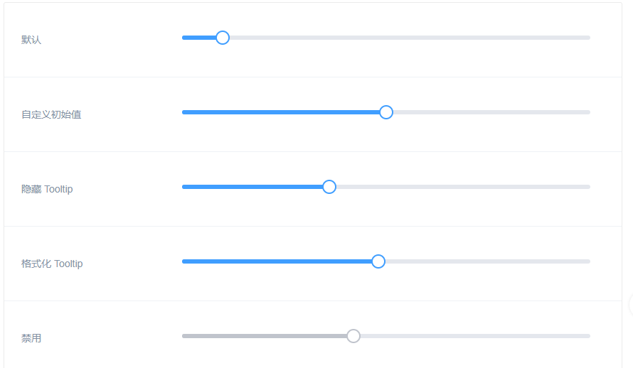 组件—滑块基础用法<template><divclass="block"><spanclass="demonstration">默认</span><el-sliderv-model="value1"></el-slider></div><divclass="block"><spanclass="demonstration">自定义初始值</span><el-sliderv-model="value2"></el-slider></div><divclass="block"><spanclass="demonstration">隐藏Tooltip</span><el-sliderv-model="value3":show-tooltip="false"></el-slider></div><di...
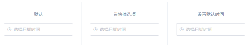 组件—日期时间选择器日期和时间点<template><divclass="block"><spanclass="demonstration">默认</span><el-date-pickerv-model="value1"type="datetime"placeholder="选择日期时间"></el-date-picker></div><divclass="block"><spanclass="demonstration">带快捷选项</span><el-date-pickerv-model="value2"type="datetime"placeholder="选择日期时间"align="right":picker-options="p...
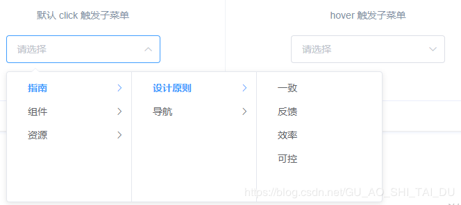 组件—级联选择器基础用法<divclass="block"><spanclass="demonstration">默认click触发子菜单</span><el-cascaderv-model="value":options="options"@change="handleChange"></el-cascader></div><divclass="block"><spanclass="demonstration">hover触发子菜单</span><el-cascaderv-model="value":options="options":props="{expandTrigger:'hover'}"@change="handleChange"></el-cascader></div><s...
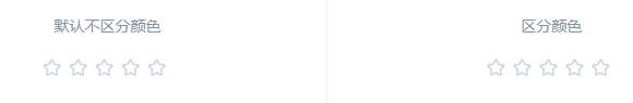 组件—评分基础用法<divclass="block"><spanclass="demonstration">默认不区分颜色</span><el-ratev-model="value1"></el-rate></div><divclass="block"><spanclass="demonstration">区分颜色</span><el-ratev-model="value2":colors="colors"></el-rate></div><script>exportdefault{data(){return{value1:null,value2:null,colors:['#99A9BF','#F7BA2A','#FF9900']//等同于{2:'#9...
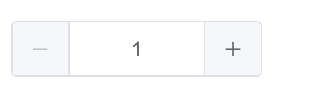
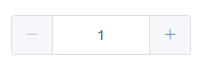 组件—计数器基础用法<template><el-input-numberv-model="num"@change="handleChange":min="1":max="10"label="描述文字"></el-input-number></template><script>exportdefault{data(){return{num:1};},methods:{handleChange(value){console.log(value);}}};</script>禁用状态<template><el-input-numberv-model="num":disabled="true"></el-input-number></template><script>exportdefault...
 辰小白小白最近在写日历模板,项目已经用了element组件,奈何element日历组件官方文档提供的资料实在太少了。所以这里希望有相关开发需要的朋友能够少走一些辰小白踩过的坑。首先展示一些模板效果图: 这个项目的详细介绍可以下辰小白的这篇文章:后端开发的福音,vue+element实现的vue-element-admin前台框架,开箱即用下面是日历模板首页源码<template><div><el-cardclass="_calendar"><el-container><el...
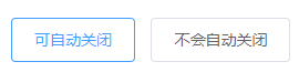 组件—通知基本用法<template><el-buttonplain@click="open1">可自动关闭</el-button><el-buttonplain@click="open2">不会自动关闭</el-button></template><script>exportdefault{methods:{open1(){consth=this.$createElement;this.$notify({title:'标题名称',message:h('i',{style:'color:teal'},'这是提示文案这是提示文案这是提示文案这是提示文案这是提示文案这是提...
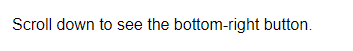 组件—回到顶部基础用法<template>Scrolldowntoseethebottom-rightbutton.<el-backtoptarget=".page-component__scroll.el-scrollbar__wrap"></el-backtop></template>自定义显示内容<template>Scrolldowntoseethebottom-rightbutton.<el-backtoptarget=".page-component__scroll.el-scrollbar__wrap":bottom="100"><divstyle="{height:100%;width:100%;background-color:#f2f5f6;box-shadow:...
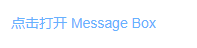 组件—弹框消息提示<template><el-buttontype="text"@click="open">点击打开MessageBox</el-button></template><script>exportdefault{methods:{open(){this.$alert('这是一段内容','标题名称',{confirmButtonText:'确定',callback:action=>{this.$message({type:'info',message:`action:${action}`});}});}}}</script>确认消息<template><el-...
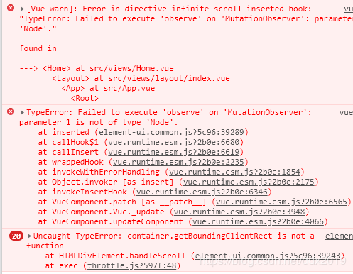 一、问题描述在使用Element的InfiniteScroll无限滚动时候出现以下错误:TypeError:Failedtoexecute'observe'on'MutationObserver':parameter1isnotoftype'Node'InfiniteScroll的更多用法element官网二、解决办法给需要使用InfiniteScroll的元素或者它的父级元素加上overflow:auto;属性即可。<template><divclass="home"><divv-infinite-scroll="loadMore"v-for="iincount"class="infinite-list":key...
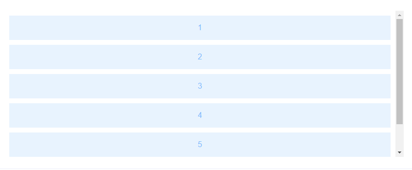 基础用法<template><ulclass="infinite-list"v-infinite-scroll="load"><liv-for="iincount"class="infinite-list-item">{{i}}</li></ul></template><script>exportdefault{data(){return{count:0}},methods:{load(){this.count+=2}}}</script>禁用加载<template><divclass="infinite-list-wrapper"><ulclass="list"v-infinite-scroll="load"infinite-scroll-d...
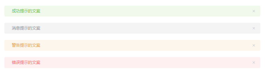 组件—警告基本用法<template><el-alerttitle="成功提示的文案"type="success"></el-alert><el-alerttitle="消息提示的文案"type="info"></el-alert><el-alerttitle="警告提示的文案"type="warning"></el-alert><el-alerttitle="错误提示的文案"type="error"></el-alert></template>主题<template><el-alerttitle="成功提示的文案"type="success"effect="dark"></el-alert><el-alerttitle="消...
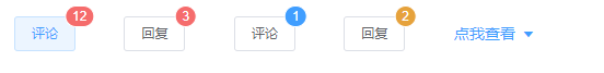 组件—标记基础用法<el-badge:value="12"class="item"><el-buttonsize="small">评论</el-button></el-badge><el-badge:value="3"class="item"><el-buttonsize="small">回复</el-button></el-badge><el-badge:value="1"class="item"type="primary"><el-buttonsize="small">评论</el-button></el-badge><el-badge:value="2"class="item"type="warning"><el-buttonsize="small">回复</el-button></el-badge><el-dro...